Table of Contents
“This step-by-step guide will walk you through installing, setting up, and customizing your KeyCrafter theme, so you can build a polished and engaging website that perfectly showcases your key-making or locksmith business.”
Keycrafters Pro Theme Documentation
Introduction
Customizing Your Website
Global Settings
To set global styles:
- Go to Elementor > Site Settings.
- Adjust typography, colors, and layout settings.

Header & Footer Setup
- Use Elementor Theme Builder to edit the header and footer.
- Customize the navigation menu, logo, and contact details.


You can drag and drop the elementor widget’s menu first. If you’d like, you can add items or simply drag each one, after which you can add a social icon from the widget and menu cart than apply a custom style from the style option.

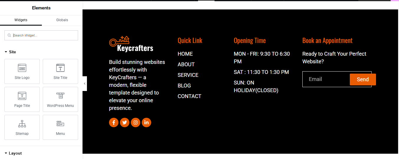
you can add contact details , timing, logo, menu and if you wish in footer, and create you best design.
Home Page Setup
Using Pre-Built Layouts
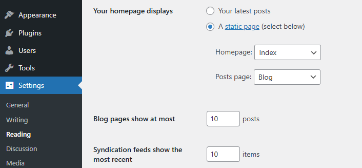
Navigate to Setting >> Reading
Choose the Static Page option.
Choose an existing homepage or create a new one.
Add The Section in home page using elementor
Add components such as these using the Drag & Drop Builder:
- Hero Section
- About Us Section
- Our Services
- CTA Section
- Why Choose us
- Our Progress
- Pricing Package
- Appointment
- Our Expert Team
- Testimonial
- Our Latest Blog
- Contact
Main Hero Section
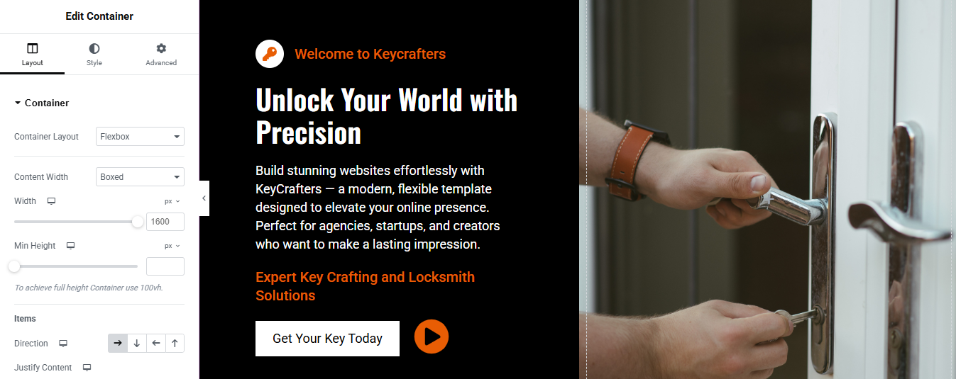

Section Layout
- Structure: Two-column layout (Left: Content, Right: Image)
- Content Width: Boxed (1600px)
- Layout Type: Flexbox
- Min Height: 100vh (full screen height)
- Direction: Row (left to right)
Left Column: Text Content
- Top Label (Small Heading):
Text: Welcome to Keycrafters
Style:- Font Size: 16px
- Text Color: #FF6600 (or any bold orange)
- Weight: Medium
- Main Heading:
- Font Size: 48px
- Weight: Bold
- Line Height: 1.2
- Text Color: White
- Paragraph Text:
- Font Size: 18px
- Text Color: Light Gray (#E0E0E0)
- Line Height: 1.6
- Highlight Text
- Color: #FF6600
Font Weight: Bold
CTA Button
- Text: Get Your Key Today
- Background Color: Black or Dark Gray (#111111)
- Text Color: White
- Border Radius: 6px
- Padding: 15px 30px
- Hover Effect: Slight scale-up or light background transition
- Icon: Play Icon (optional, placed on right)
- Link: Direct to contact or service page
Right Column: Image
- Image Type: High-quality locksmith image (e.g., hands unlocking door)
- Alignment: Center
- Image Fit: Cover or Contain
- Border Radius: 10px
- Shadow: Soft drop shadow for depth
- Overlay (Optional): Dark transparent overlay on hover with fade-in effect
About Us
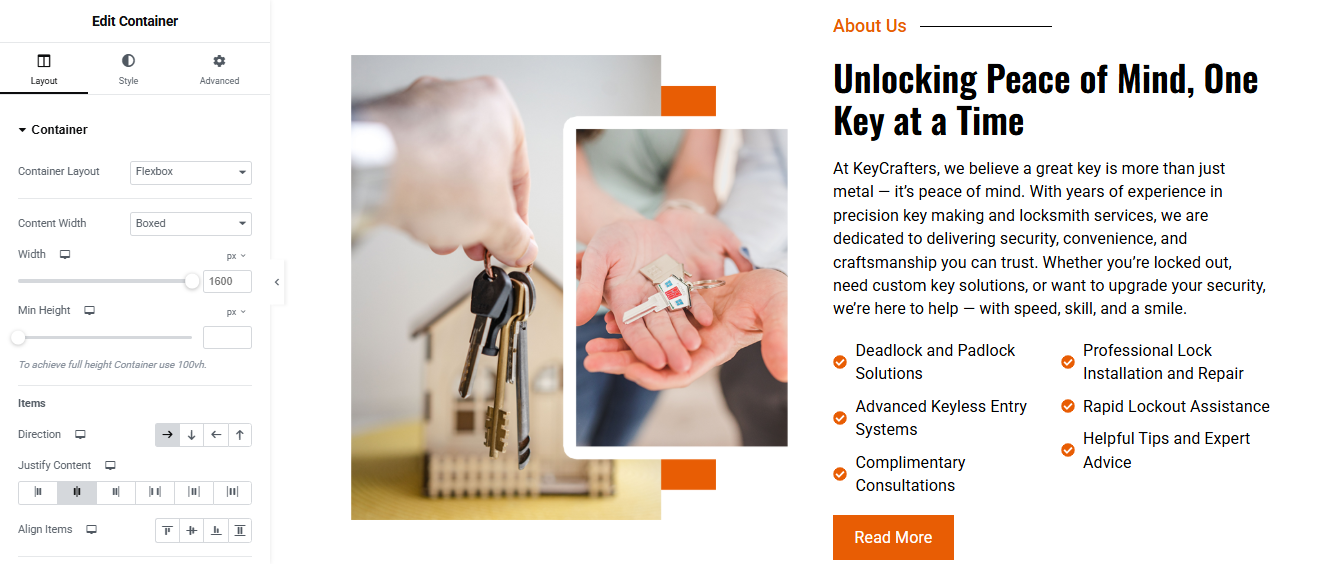
Left Column: Image Block
- Widget Used: Image widget (or two stacked if needed)
- Image Style:
- Use high-quality, relevant locksmith imagery (e.g., hands holding keys or a house key handoff).
- Border Radius: 10–15px for a soft modern look
- Box Shadow: Light drop shadow for depth
- Optional Frame: Add a white border or shape divider for layered look
- Offset Accent Shapes: Use spacer widgets or shape dividers for the orange decorative blocks behind the image
Right Column: Text & Services List
Heading Widget
- Text:
- Font Size: 36–48px
- Font Weight: Bold
- Color: Dark (#000)
- Line Height: 1.2
Text Editor Widget
- Add your main paragraph content:
- Font Size: 18px
- Line Height: 1.6
- Text Color: #333333
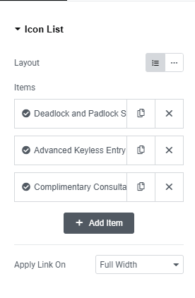
Icon List Widget (Service Features)
- Create two icon lists side-by-side using a two-column inner section
- Use checkmark icons or custom icons matching your brand
- Each list item example:
Icon Color: Orange (#FF6600) - Text Color: #000
- Spacing: 10–15px between items
- CTA Button: “Read More”
Button Text: Read More- Background Color: Orange (#E25C1A or #FF6600)
- Text Color: White
- Border Radius: 6px
- Padding: 12px 24px
- Hover Effect: Slight lighten or scale
- Link: Direct to your full About page or services details
Our Services
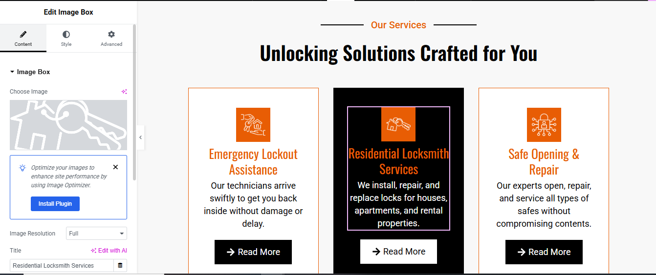
Add an Image Box Widget in Each Column
Inside the Image Box Widget:
- Choose Image: Add your service icon (PNG or SVG preferred)
- Title: e.g., Emergency Lockout Assistance
- Description:
- Alignment: Center
- Style the Image Box (Per Column)
- Background: Use different background styles:
- Column 1 & 3: White with Orange Border
- Column 2 (middle): Dark Background (e.g., #0C0C0C) with White Text for contrast
- Icon Styling:
- Size: 50–70px
- Spacing Below Icon: 20px
- Icon Background Box: Optional Orange background (#FF6600)
- Title Styling:
- Color:
- Orange (#E25C1A or #FF6600) for light backgrounds
- White for dark background (middle card)
- Font Size: 22–26px
- Font Weight: 600 or Bold
- Spacing Below Title: 10px
- Description Styling:
Color: - Font Size: 16–18px
- Line Height: 1.5
Add a “Read More” Button Below Each Service
Use a Button widget under each service card.
- Button Settings:
Text: → Read More - Alignment: Center
- Style:
- Background Color: Black (#000)
- Text Color: White
- Border Radius: 4–6px
- Padding: 12px 24px
- Hover: Change background to dark gray or apply a slight scale effect
Link: Point it to the specific service details page.
CTA Section

Add Background Image or Color
- Go to the Style tab of the container.
- Background Type: Classic
- Image: Upload the background image (e.g., keys photo)
- Position: Center Right
- Size: Cover
- Repeat: No-repeat
- Overlay: Add a dark overlay (e.g., black with 0.5 opacity) to make text readable.
Add a Left Column (for Text + Button)
Drag in a nested container or inner section and place it on the left.
Add the following widgets:
- Heading Widget
- Text: Need a Key Solution Fast?
- Style: Bold, White, Size ~40–50px
- Text Editor Widget
- Text:+ paragraph description
- Style: White or light gray, 16–18px
- Button Widget
- Text: Request Service Now
- Style:
- Background: White
- Text Color: Black
- Padding: 20px 30px
- Border Radius: 4–8px
- Hover effect: Slight background change or scale
Why Choose Us

Left Side – Content Area
Add a nested container or widgets inside the left section.
👉 Add the following widgets:
- Heading Widget
- Text:
- Style: Small size, orange color, and maybe with an underline for emphasis.
- Heading Widget (Main Title)
- Text: Security You Can Feel, Service You Can Trust.
- Style: Bold, large size (e.g., 40–50px), black.
- Text Editor Widget
- Add a detailed paragraph about your service values and what makes your business stand out.
- Style: Font size ~16–18px, line spacing ~1.6 for readability.
Progress Bar Widgets (3 items)
- Widget: Progress Bar
- First Title: Fast Response Time — Percentage: 86%
- Second Title: Advanced Tools & Techniques — Percentage: 96%
- Third Title: Customer Satisfaction First — Percentage: 99%
- Style:
- Bar Color: Orange or brand color
- Background: Light gray
- Text: Left aligned
- Height: 10–12px for clean look
Right Side – Image
Add an Image Widget inside the right container.
- Upload your image (e.g., vintage keys hanging).
- Style:
- Set Width: Auto or 100%
- Add Border Radius: e.g., 20px (if you want rounded corners)
- Optionally: Add a dotted background graphic via a section background or image overlay
Our Progress

Create Four Inner Containers (One for Each Stat)
- Inside the main container, add 4 inner containers or use columns (for older section layouts).
- Each inner container will hold:
- Icon Widget
- Counter Widget
- Heading or Text Widget
Add Counter Widget (For Stats)
- Widget: Counter
- Starting Number: 0
- Ending Number: (e.g., 15, 45, 14000, 550)
- Number Suffix: + or K+ depending on the item
- Animation Duration: 2000 ms (2 seconds)
- Thousand Separator: Show (if large numbers)
Add Icons
- Use Icon Widget above each counter.
- Choose relevant icons:
- Key or briefcase for experience
- Users icon for team
- Star for reviews
- Trophy for completed projects
- Set icon size: 40–60px
- Icon Color: Orange (or brand color)
- Add padding/margin below the icon.
Add Text (Label)
- Add Text Editor or Heading Widget below the counter.
Style the Section
- Background Image or Color: Add a dark overlay if you use an image.
- Padding: 50–80px top and bottom.
- Spacing: Use margin or padding to separate each stat.
- Border or Box Shadow: Optional, for extra emphasis.
Pricing Package

Design Each Column as a Pricing Box
- You’ll build three pricing plans: Basic, Standard, and Premium.
- Inside each column, add the following widgets (from top to bottom):
Icon or Image Widget
- Add an icon that represents the package (key, home, lock, etc.).
- Size: ~60px
- Align center
- Color: Orange (or your brand color)
Heading Widget – Package Title
- Example: Basic Package, Standard Package, Premium Package
- Font weight: Bold
- Align center
Text Editor – Subtitle
- Example:
- “Perfect for simple key needs”
- “Ideal for home and small office security”
- “Complete peace of mind, 24/7”
- Font size: 14–16px
- Color: light gray or muted black
Heading Widget – Price
- Example: $49 /month
- Break this into:
- $49 – large and bold
- /month – smaller, regular font
Text Editor – Feature List
- Add bullet points for what’s included:
- Use checkmark icons for each line (via Icon List Widget)
- Keep it to 4–6 features.
- Font size: 14–16px
Button Widget – Call to Action
- Text: Get Started
- Style: Fill or outline (depending on the background)
- Align: Center
- Add hover effect for interactivity
Style the Packages
- Use Box Shadows or Borders for visual separation.
- Background:
- Light for Basic and Premium.
- Dark (Black or Dark Gray) for the highlighted “Standard” package.
- Adjust padding and spacing for a clean layout.
- Use consistent fonts, sizes, and icon styles across all cards.
Highlight the Best Value Plan
- Make the middle package stand out:
- Use a dark background with white text.
- Apply a shadow or border glow.
- Increase the size slightly if needed.
Appointments Section

Left Column: Company Info and Service Highlights
Heading Widget (Title)
- Example: The Ideal Answer For Every Locksmith Need
- Style:
- Font size: 24–28px
- Color: Brand accent color (e.g. orange)
- Weight: Bold
✏️ Text Editor (Company Description)
- Short paragraph about your mission or services.
- Keep it 2–4 lines for clarity.
✅ Icon List Widget
- List of features:
- Online Appointment Form
- Service Selection Dropdown
- Use tick/checkmark or appropriate icons.
- Font color: White or light gray (on dark background)
🔘 Button Widget – “View All Services”
- Style: Bordered or solid
- Align: Left or center
- Add a link to your services page
📍 Info Section (Text + Icons)
- Use separate Icon + Text Widgets or an Icon List for:
- Address
- Phone
Right Column: Appointment Booking Form
- Use the Form Widget (Elementor Pro) or WPForms/Contact Form 7 (with shortcode for free users).
📋 Fields to Add:
- Name – Text field
- Email – Email field
- Telephone – Tel field
- Date – Date picker field
- Select Services – Dropdown (Add service options)
- Message – Textarea
🧡 Submit Button
- Text: Make Appointment
- Style:
- Background color: Orange (or your brand color)
- Text color: White
- Border radius: 5–10px
- Add hover effect for interaction
⚙️ 3. Form Settings (Elementor Pro only)
- Go to Form > Actions After Submit
- Add: Email, Webhook (if needed)
- Set up the email where appointment requests are sent.
- Enable email notifications with all field data.
Our Team

Add Headings
Drag these widgets into the section, above the team cards:
- Heading 1: Small title – Team (Style with a divider line or subtle accent)
- Heading 2: Main title – Meet Our Experts
- Typography: Bold
- Size: 32–40px
- Alignment: Center
Create Each Team Member Card (Repeat for Each Member)
For each column (team member), do the following:
a. Add an Image Widget
- Upload the team member’s photo.
- Style:
- Size: Medium/Large
- Border radius: Optional (circle or rounded)
- Shadow: Subtle box shadow for depth
b. Add a Heading Widget
- Name of the team member (e.g., John Mitchell)
- Style:
- Font weight: Bold
- Font color: Brand accent (e.g. orange)
c. Add a Text Editor Widget
- Job title (e.g., Master Locksmith)
- Style: Regular font, smaller size
d. Add Social Icons Widget
- Place it vertically next to or over the photo
- Include icons: Facebook, X (Twitter), YouTube, LinkedIn, etc.
- Align: Right or center
- Style:
- Shape: Circle
- Size: Medium
- Color: Brand colors or custom (orange background with white icons)
Style the Cards
- Add border or box shadow to each card
- Add padding inside the column/container (10–20px)
- Optionally wrap each card in a Container or Inner Section and style it like a card.
Review Section

Add Heading
- Heading 1: Small title
- Heading 2: Main title
- Typography: Bold
- Size: 32–40px
- Alignment: Center
Add Carousel/Slider (Pro)
- If you want to show multiple reviews in a slider:
- Elementor Pro: Use Carousel slider
- Free Elementor: Use third-party plugin like “Essential Addons” or “Element Pack”
- Drag the Carousel slider widget
- Add multiple reviews inside the carousel
- Set transition speed, autoplay, loop, etc.
- Enter:
- Reviewer’s name
- Image (optional)
- Title or role (e.g., “Customer”)
- Review text
- Style:
- Star rating
- Background box
- Quote icon
- Font styles
Repeat or use carousel settings for sliding reviews
Blog Section

Use a Blog Posts Widget
Option A: Elementor Pro – Use “Posts” Widget
- Drag the Posts widget into your section.
- It will automatically display your latest blog posts.
- Customize:
- Layout: Grid, List, Masonry, or Carousel
- Columns: Choose how many posts to show per row
- Post Count: Set the number of posts to display
- Content: Show/hide featured image, title, meta, excerpt, read more link
Customize Blog Card Design
- Add spacing, background color, or shadows to make each post card stand out
- Show author name, date, and category
- Control image size and excerpt length
- Add “Read More” buttons to each post
Add Section Heading
- Above your blog grid, add a Heading widget
- Example: “Latest News” / “From Our Blog” / “Tips & Guides”
Enable Pagination or Load More
- In the Posts widget (Pro), turn on pagination if you have many posts.
- Choose numbers, next/prev, or infinite scroll.
Style the Blog Section
- Use custom colors, fonts, padding, and shadows to match your site theme.
- Make the cards clickable or add hover effects for engagement.
Contact Section

Add a Contact Form
If you’re using Elementor Pro:
- Drag the Form widget into one column.
- Add the following fields:
- Name
- Phone Number (optional)
- Message
- Submit Button (label it “Send” or “Submit”)
- Customize the layout, spacing, and field labels as needed.
If using Free Elementor:
- Install a free form plugin like:
- WPForms
- Contact Form 7
- Forminator
- Create your form in the plugin dashboard
- Copy the shortcode
- Drag a Shortcode widget into the section and paste the form shortcode
Add Contact Information (Left Column)
- Use Icon Box or Text Editor widgets to show:
- 📍 Address – Your business location
- 📧 Email Address
- 📞 Phone Number
- 🕒 Opening Hours (optional)
- 🔗 Social Media Links (optional: use icons)
Add Google Map
- Drag the Google Maps widget below or beside the form
- Enter your address
- Customize zoom level and height
Style the Contact Section
- Adjust padding, background color, and font size
- Add borders or shadows to the form
- Make sure it fits well with the rest of your website’s design